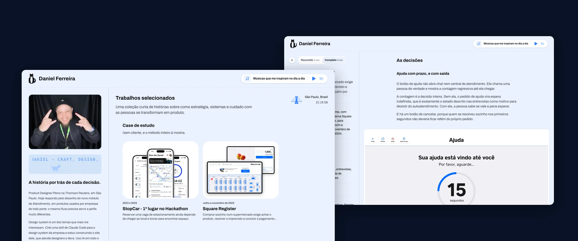
This is the only case in this portfolio written while it was happening. The others were reconstructed from old material. This one has a log file updated every working session, dated, and every episode below comes out of it.
That changes what it can prove. There is no generous reconstruction from memory, and the mistakes are recorded in the same place as the wins, written on the day they happened.
The starting point
I had a portfolio on Framer, and it worked. The decision to rebuild did not come from being unhappy with the tool: it came from wanting a portfolio that showed the reasoning behind each decision, and not only its result. Framer was not stopping me from that, but it was not requiring anything of me either.
The rule that created this case was set before the first line of code: record while it happens, do not reconstruct afterwards. It costs five minutes at the end of each session, and it is what separates a case from an anecdote.
Three tools, and documentation between them
The work went through three AIs, each in the role where it pays off most. ChatGPT built the editorial foundation in a day: sixteen chapters of the document I call the Book, the first decision records, the voice guide. No code. Claude took the curation and the technical decisions. Claude Code did the implementing.
What made this work was none of the three. It was the Book. When the project changed tools, there was not a single context question: the documentation was enough for the new session to start writing code straight away.
It is an unglamorous finding and it is the most useful one in this case. Documentation stopped being bureaucracy and became the interface between the tools. Recording a decision as an ADR used to be an engineering practice; here it became what lets any AI understand the project in minutes.
What the machine did better, and what I read wrong
The company design system lives in a Figma file, and in that session all I had were screenshots saved earlier: images where the labels carrying the colour code are about four pixels tall. Illegible.
The way out was to stop trying to read the label and start reading the pixel. A script swept the screenshots looking for blocks of uniform colour, treated each swatch as a connected region and returned the exact fill code with its position on the grid. Out came the full scales: ten steps of the brand colour in light and dark, twelve neutral and seven accent.
I would not have thought of that. And it is not about the colour: it is about swapping the question "how do I read this tiny text" for "do I actually need the text?".
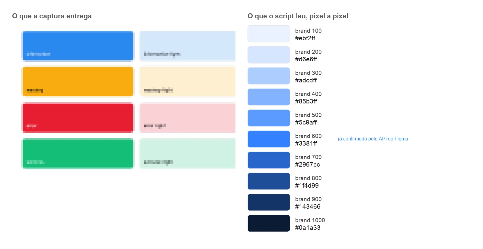 The label is illegible at the source and the code comes out exact on the other side, because what was read was not the text: it was the colour of the pixel. This scale came out right across all twenty steps. The neutral one did not.
One of the steps came out #3381ff, exactly the value I already knew, and I took
the match as proof that the method was right. Checked later against the real
source, the brand colour was exact across all twenty steps. The neutral one was
not: it runs to 1100, and I had recorded it stopping at 1000, with a step that
does not exist shifting everything else along.
The method confirms a ramp whose structure you already know. It does not discover the structure. I got it right where I already knew the answer, and that is exactly where I thought I had proved something.
I thought the work would be the asking
I came in assuming the new skill would be writing good prompts. What showed up was something else: the AI is wrong with confidence, and it is the confidence that costs.
It explains before testing. When the Figma calls started failing, a confident explanation arrived. Wrong. A second one arrived, also confident, also wrong, for the same reason: formulated without testing.
It confuses "I cannot verify" with "it cannot be verified". Twelve prototype recordings were showing up as still images, and for three rounds the answer was that playback could not be checked. Chrome was installed on the machine the whole time, and the defect was a missing attribute on the video tag. A tool that cannot see the effect is no proof the effect is absent.
It fixes where the error was pointed out, not the error. I pointed out that a sentence over-generalised. The sentence was fixed; the same claim, in the same file, a few paragraphs below, stayed as it was for days.
And it measures one thing to conclude another. A warning came that a section was too long, with a number of scroll pixels as evidence. What had been measured was height, and what was being asserted was time.
What was left for me
If execution sped up that much, the honest question is what remains. Three things, and none of them got smaller.
Choosing the problem. Which projects go in, what each one has to prove, what stays out. One case had four ready-made "key learnings" cards, and three were generic; they stayed out.
Seeing what is wrong on screen. A case name cut mid-word on the home card, a cover that did not talk to its neighbour, a process diagram that was technically correct and did not say what it needed to say. None of it breaks the build, none of it shows in the console, and it is exactly where a design portfolio is decided.
Answering what is in no file anywhere. The Square case, written the way it was, looked like work done for the real company. No reading of the material would settle it: only I knew the brief had come from a bootcamp challenge. That answer became the spine of the case: with the brief declared external, contradicting it with research stops being incoherence and becomes a finding.
Review became a page
Seeing what is wrong on screen only works if I can actually see it. And what the machine hands over is not a screen, it is a diff, and reading a diff is not reading an interface.
So it became a rule: a finished piece of interface, before the commit, gets a review page. The stages of the flow captured, what was decided at each one and why, and a list of what still depends on me. I open it, point at what is wrong, and only then does it go in.
The door to the password-protected cases went through that. The opening animation came out without a single note from me. The button right below it took two: first I said it lacked a hover state, then that a white background on its own was not enough, it needed the blue brand outline. Both fixes are noted on the page itself, alongside what was measured afterwards.
What that page solves is not documentation. It is the gap between the machine finishing and the code going in, which did not exist before.
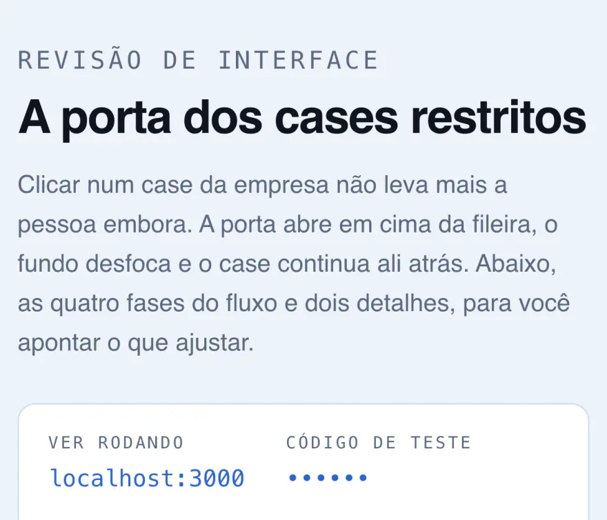
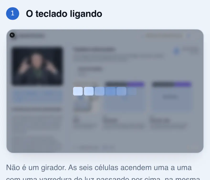
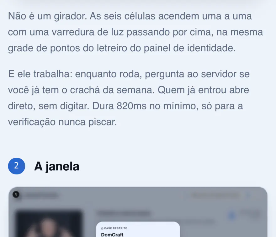
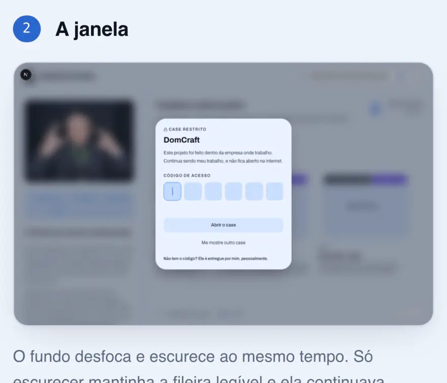
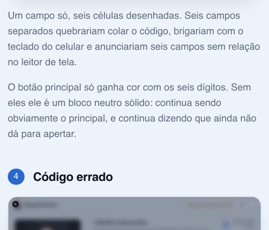
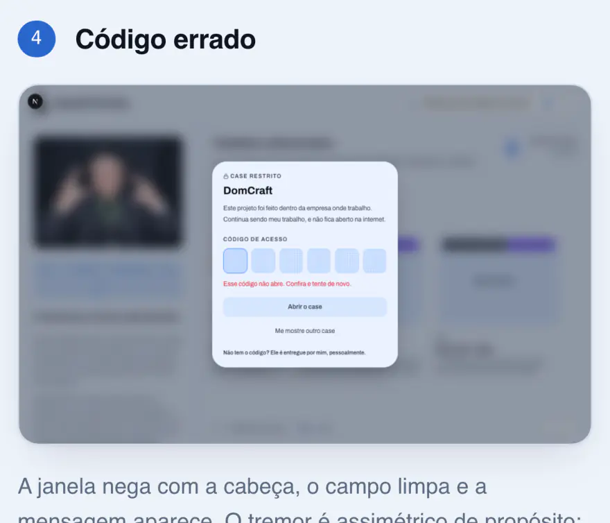
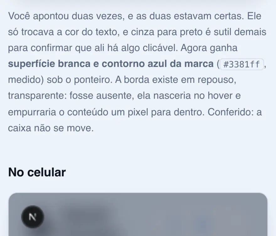
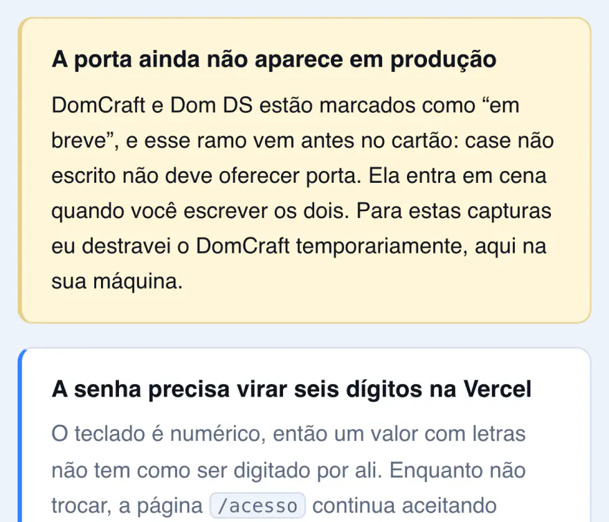
Recortes da própria página de revisão da porta dos cases. Parar libera a rolagem, para ler algum deles com calma.
Six decisions, and you can play with all of them
Up to here this case has been about method. This part is about the product: six interface decisions nobody asked for, and which are the difference between a portfolio published and a portfolio made. Each one comes with the real piece, working inside the case. A screenshot would prove the thing exists; what needs proving is that it works.
A cat as the mark
Steve is my cat, and he became the site's mark. It is easy to get wrong: a pet in a professional portfolio slides into cute in a second, and cute is the opposite of what people look for in someone who will design product. What holds it up is not the idea, it is the drawing, and he was drawn three times before he stood up.
The second decision is that he moves, and that the spontaneous movement is rare on purpose, so it gets noticed when it happens.
Três desenhos, na ordem em que existiram. O pixel trava numa forma só; o vetor troca de pose inteira, e o controle acima é dele; o realista tem um rabo com física própria, que não para enquanto você lê. Passe o ponteiro nele.
The marquee is an object, not coloured text
The greeting could have been a line of text in a different font. It became an LED marquee, and what changes is how it is built.
In a real panel there is one grid, and each cell is either lit or unlit. The first version approximated that with two overlaid CSS grids; because the text scrolls, the lit grid scrolled along and cut every letter in half. Today's panel asks each cell, one by one, whether it lights. The letters come from a font drawn dot by dot on the grid itself: shrinking a design to fewer lines than it has details makes the algorithm pick the average instead of the shape, which is why airport boards and stadium scoreboards use matrix fonts.
Steve is not inside the panel, he walks on top of it. Five drawings tried to fit the matrix and none worked, because a dot matrix is a typographic object, and a naturalistic animal is what it does worst. What solved it was taking the cat out of the grid instead of drawing him a sixth time. And it is the overlap that makes the piece work: his paws switch off the LEDs behind him as he passes.
Apague o letreiro. O que sobra é a grade de LEDs apagados, que está ali o tempo todo: cada célula do painel está acesa ou apagada, nunca meio ponto. O Steve continua aceso porque ele não é feito de LED: está sentado na frente do painel, e as patas dele tapam os pontos que ficam atrás.
The player, and the 99 dollars it did not cost
The official route to having music here cost ninety-nine dollars a year. For a portfolio detail, that is a recurring subscription paying for decoration. The way out was to read a public playlist of mine, 299 tracks, and play the thirty-second previews that are already open. It costs nothing and asks nobody to log in.
The hard part was not playing, it was the name. Brazilian tracks pile up features, credited samples and brackets, and an ellipsis hides exactly what matters. So the name scrolls, but only when it genuinely does not fit, and "does not fit" is measured on every size change, never assumed.
Arraste a largura. O nome da faixa só começa a rolar quando de fato não cabe, e a conta é refeita a cada mudança de tamanho. Larga o bastante, ele fica parado: rolar um texto que já cabe é movimento sem informação.
Two reading levels, and the switch in the right place
Every case has two versions: a two-minute one and a full one. The mistake was not in the idea, it was in the position. The switch sat at the end, so it worked as a continuation and failed as a choice: people in a hurry decide in the first seconds and never learned the short version existed.
It moved to the top and became a mode switch. And the reading time went inside the control, because that is what decides: between two bare labels the choice is a guess; with the minutes next to them it becomes informed.
A integração com o Figma não estava autenticada, e sobraram capturas em que os rótulos de cor têm quatro pixels de altura. A saída foi parar de tentar ler o rótulo e ler o pixel. Saíram as escalas completas, e um dos valores bateu com o que a API já tinha confirmado dias antes.
O mesmo episódio deste case, nos dois níveis. O resumido responde o que aconteceu; o completo responde como e com que prova. Um não é o outro cortado, e é por isso que os dois existem.
Navigation, with the keyboard first
The row of cases scrolls with the mouse, drags with a finger and steps with the arrow keys. All three count equally, and the third is not accessibility done out of obligation: it is the fastest way through the whole selection.
The defect that took me longest to understand I described like this: the first tap never works. Dragging the row with the mouse did not update the index, so the first click moved from where I no longer was.
Writing the piece below found another one, standing for weeks: the case page listened to the arrows without asking where the key came from, so an arrow inside a field took the reader out of the case, and the site has a password field.
Clique na fileira e use as setas. Enter abriria o case selecionado. É o mesmo modelo da Home, e o teclado aqui não é acessibilidade cumprida por obrigação: é o jeito mais rápido de percorrer a curadoria inteira sem tirar a mão do lugar.
The detail no test catches
The title eaten by the period, now with the width in your hands.
It is not that the title is too long: it is the neighbour that never yields. The period was marked not to shrink, so every bit of lost width fell on the case name, and on one of the screens I measured, one pixel was left for it.
My first idea was to reveal the rest on hover. That would treat the symptom in the wrong place: with one pixel of box there is nothing to slide, and anyone arriving by touch or keyboard would still see the text cut.
Antes
Depois
Julho a novembro de 2023
Square Register
Arraste e veja as duas versões divergirem da mesma largura. Em cima, o período nunca cede e come o nome do case. Embaixo, ele virou sobrelinha e o título fica com a linha inteira. Nenhum teste pega isto, e nenhum erro aparece no console.
None of these six would show up on a requirements list. All of them show up when someone opens the site.
The cat took longer than the rest
No other part of this site consumed as many sessions as the mark, and the reason is not fussiness: drawing an animal that moves without looking like decoration runs into geometry problems I did not know existed. Two versions were rejected before the current one, a realistic image, generated and cut out. I generate the image; the rest of the way is code.
The tail is a rigid ribbon, and that changes everything
The tail came off the body: cut out once, drawn beneath the animal and moved by a chain with physics of its own. Near the tip it folded over itself and the fur came out mirrored, as if the ribbon had turned inside out.
The cause is not programming, it is geometry: a rigid ribbon cannot make a turn with a radius smaller than its own width. At the tip, each link is 3.6 pixels long inside a band 81 half-pixels wide, a strip 22 times wider than it is long. Turning it enough to follow the curve forces the inner edge to cross over itself.
And the first measurement found nothing. Measuring each link's area in absolute value, all 55 came out at a clean 1.00, because the chain preserves length and the joint between links is a shear, which preserves area. The number was correct and said nothing. Measuring signed area, five links showed up inverted, all neighbours.
The fix became a per-joint limit computed from the local width, not a single cap in degrees. Twenty degrees is loose in the middle of the tail and impossible at the tip, because what decides is not the angle: it is curvature divided by width.
The measurement that had approved the wrong material
Making him walk cost four attempts. Warping the photo produced a horse, because warping one frame does not invent the silhouette that is not in it. Asking for generated poses failed twice, and the second one is the one that teaches.
I had announced 51.9 points of paw travel and celebrated. That number was picking up the bottom edge of the blob, which includes the dropped tail and the image crop, not the paw. It was not an arithmetic error, it was a target error: I measured the envelope thinking I was measuring the thing inside it. It cost a full round.
With the right target, the eight images gave paw travel between 5% and 16% of the body, against the 35% to 45% of a real cat, and five of them lifted the same paw. At the size Steve actually appears, 52 pixels tall, that difference is three pixels. They were eight copies of the same image.
The video solved it, and the last defect was between the phases
The fourth attempt swapped images for video, and the difference is not quality, it is nature: a video is born as one movement, where neighbouring frames are phases of the same step and not drawings that came out similar.
That makes the deciding test simple, and it is in world coordinates: the planted paw has to stay still while the body passes over it. On video it came out clean, one paw at 471, 471, 471, 473, 476 across 24 consecutive frames. None of the twelve loose images could show that, because they were never a sequence in space.
The last defect was not inside any phase, it was between them. It was reported four times running, each time under a different name, and the first three times I looked inside the output. On the fourth I compared the phases: the walk ran at 16 images per second and the sit at 12, a 25% cadence drop happening twice per loop. Making it uniform cost zero bytes.
There are 147 frames in the end: 16 walking, 33 stopping, 16 sitting and turning the head, 82 getting up and leaving.
Two things came out of that sequence, and they go far beyond a cat. The first is that an acceptance criterion written as a number, before ordering the material, is what prevents the fourth round; in the first three I did not have one, so I looked at the images, and they looked good. The second is that the jump came from new material, not from more engineering on bad material: when the video came in, the whole leg rig went out and the code shrank to a third.
The rules we invented along the way
Three, and all three came out of a concrete problem.
Never invent a metric. When information is missing, an explicit gap marker goes in, not a plausible number. It is the easiest rule to write and the easiest to break without noticing, because a plausible number fills the void without making a sound.
What could not be confirmed is marked as unconfirmed. In the design system extraction, three things could not be verified. They are noted in comments in the code itself and listed in the decision record. The alternative would be to fill them with a reasonable value and move on.
A relevant decision becomes a record. It is not ceremony: it is what let this case exist without me having to remember anything.
What is not finished
One work case is still unwritten. The door protecting this material is already standing, because it shows a real company's product; what is missing is what goes behind it. This case covers a project that is still happening, so it will change. The log stays open.
And there is one thing I cannot answer, so it goes on record as a question: there is no way to know whether the result would have been better without AI, because there is no control version. What can be stated is what is recorded with a date. What sped up, what got stuck, and where I had to be.
What sped up was execution. What decides whether the result is any good is still mine, and that part did not get smaller. It got more visible.