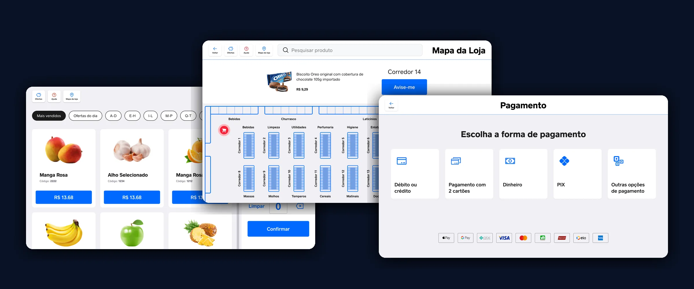
Square Register turns the trolley into a till that scans, weighs, verifies and charges. The whole shop happens on the tablet, with no checkout lane.
The first goal in the brief read like this:
How might we create a new shopping experience where the user has total autonomy?
The interviews asked for almost the opposite.
Autonomy was not being left alone
Three in-person interviews, twenty minutes each. What came up most was not speed, and it was not queues:
"Having people nearby helps me feel confident, and lets me get help fast if I need it."
Autonomy was not being left alone. It was solving the easy part yourself and having someone within reach when things break.
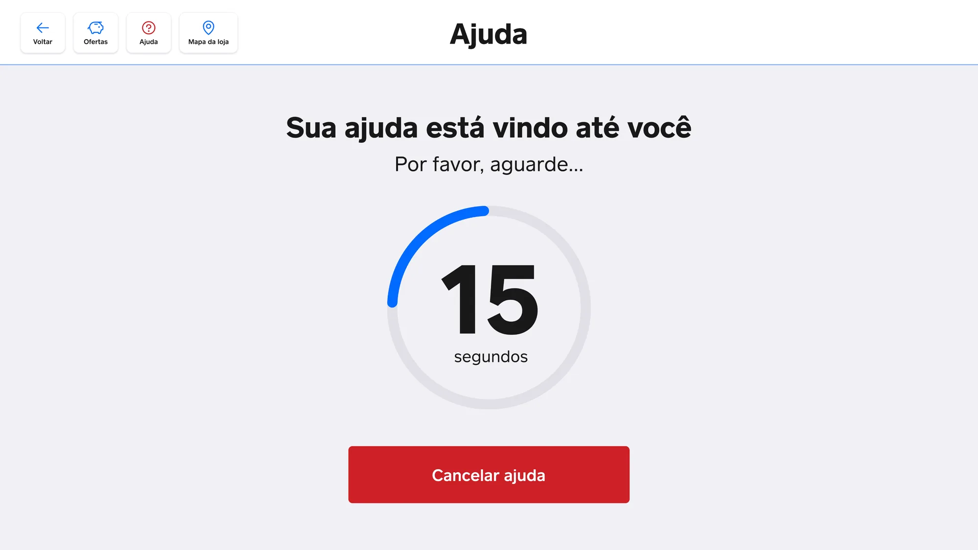 Asking for help shows how long it will take to arrive. Waiting with no end in sight is what makes people give up.
Another quote decided the form factor. I had come in with three competing bets: an app on your phone, a kiosk to finish the purchase, or a tablet with everything inside it. Two of the most concrete quotes were about weighing fruit and veg without walking anywhere. An app cannot weigh, and a kiosk means crossing the store.
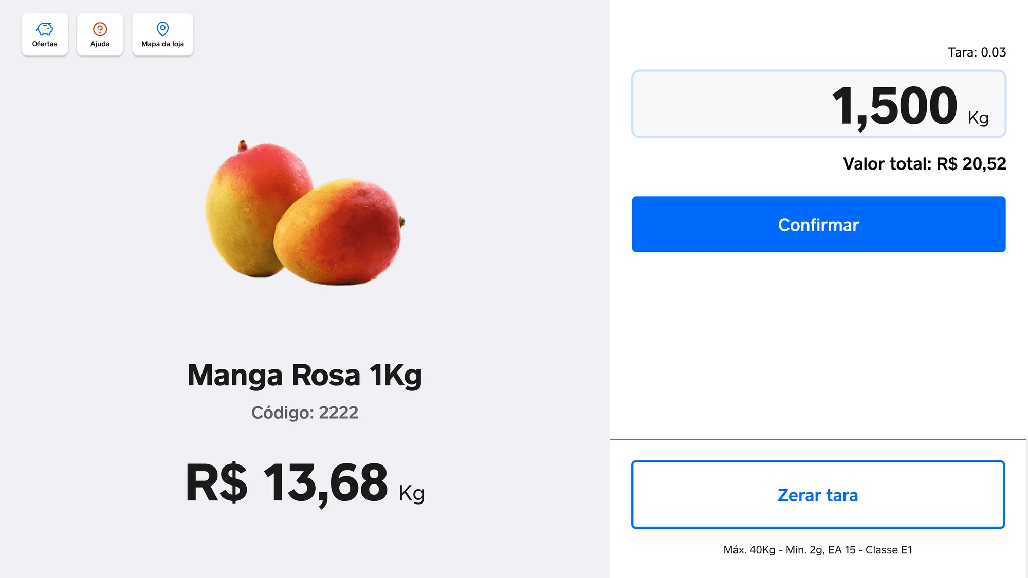 The trolley-mounted tablet won because of the scale, not because it was the most modern of the three.
Three decisions that came out of the interviews
Asking for help comes with a deadline. The button does not open a chat or a call centre: it calls a staff member and counts down until they arrive. And you can cancel, because someone who sorts it out mid-wait should not be stuck waiting anyway.
The system is what finds the product. Search returns the aisle, marks the spot on the store plan, and tells you when you walk past it. Not finding an item was the most common reason people needed a human.
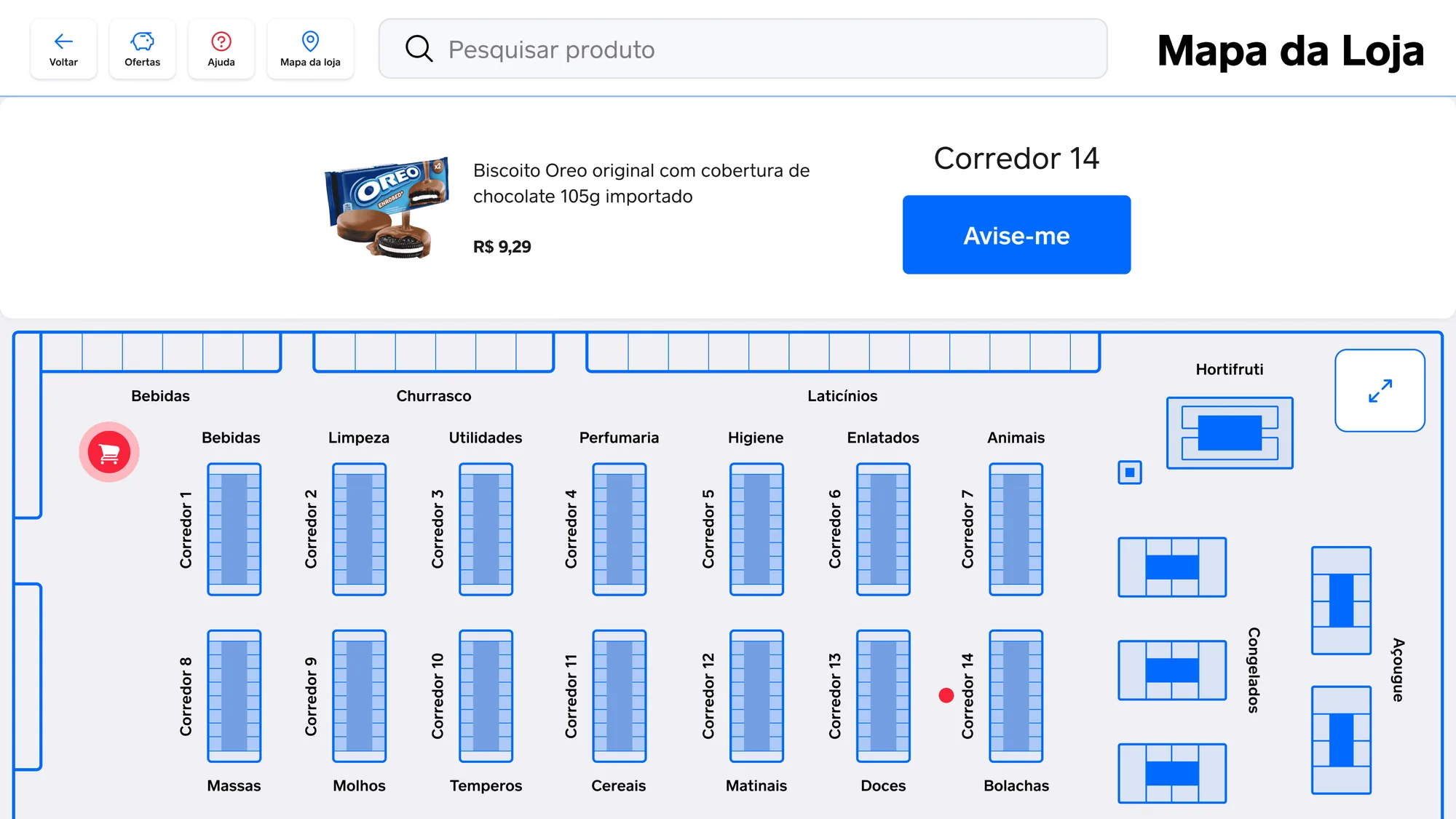 The map says where the item is and where you are. "Notify me" covers people who would rather pick it up on the way back.
Age is proven once, at the end. In the tested version, every restricted item asked for verification the moment it went into the trolley. That interrupted the shop over and over. It moved to payment, as a single check.
Pick a payment method and prove your age once, at the end.
What the test proved, and what it did not
Mid-fidelity usability testing changed two things in the product: age verification left the trolley, and search started returning the aisle.
Three interviews and one in-person test do not prove a market, and this case has no adoption numbers to show. What they changed was the question: the brief asked for total autonomy, and what the product delivers is autonomy with people nearby. It took me a while to see that the brief, not the screens, was the thing that needed rewriting.