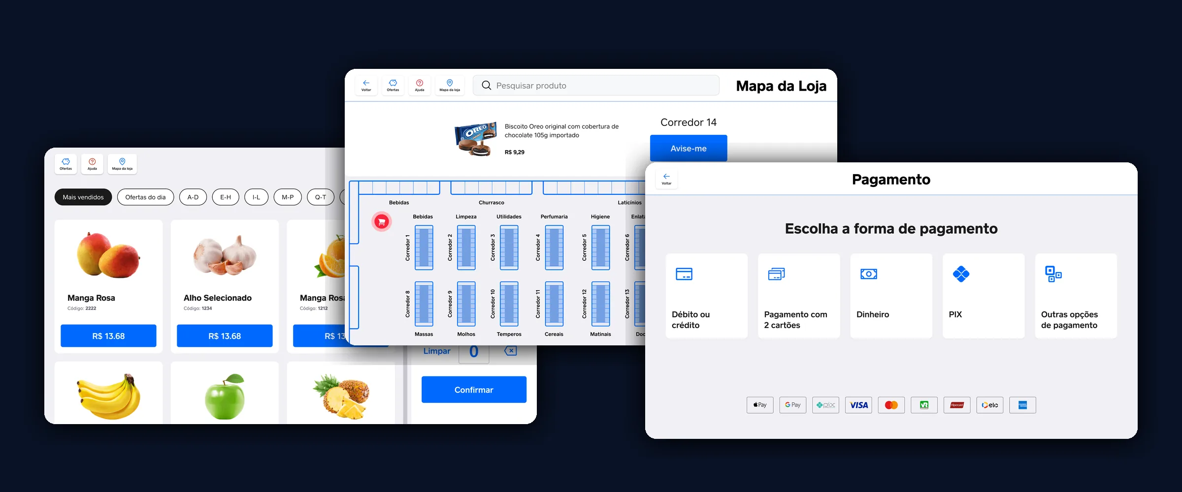
This case started with a brief I did not write, and ended up contradicting part of it. It is worth telling in that order, because it was the research that turned the table over.
The starting point
The challenge arrived ready-made: take Square Register, a point-of-sale system operated by a staff member behind a counter, and turn it into supermarket self-checkout. All on a tablet that travels with the shopper: choosing, scanning, weighing, paying and getting the receipt, without depending on another device and without going through a till.
The stated goal was to cut queues. And two targets came with it, written as questions:
01. How might we create a new shopping experience where the user has total autonomy?
02. How might we simplify the customer journey, and offer a reliable system for their shopping?
Hold on to the first one. Total autonomy is the exact phrase the research went on to contradict, and it is where the most important decision in this case comes from.
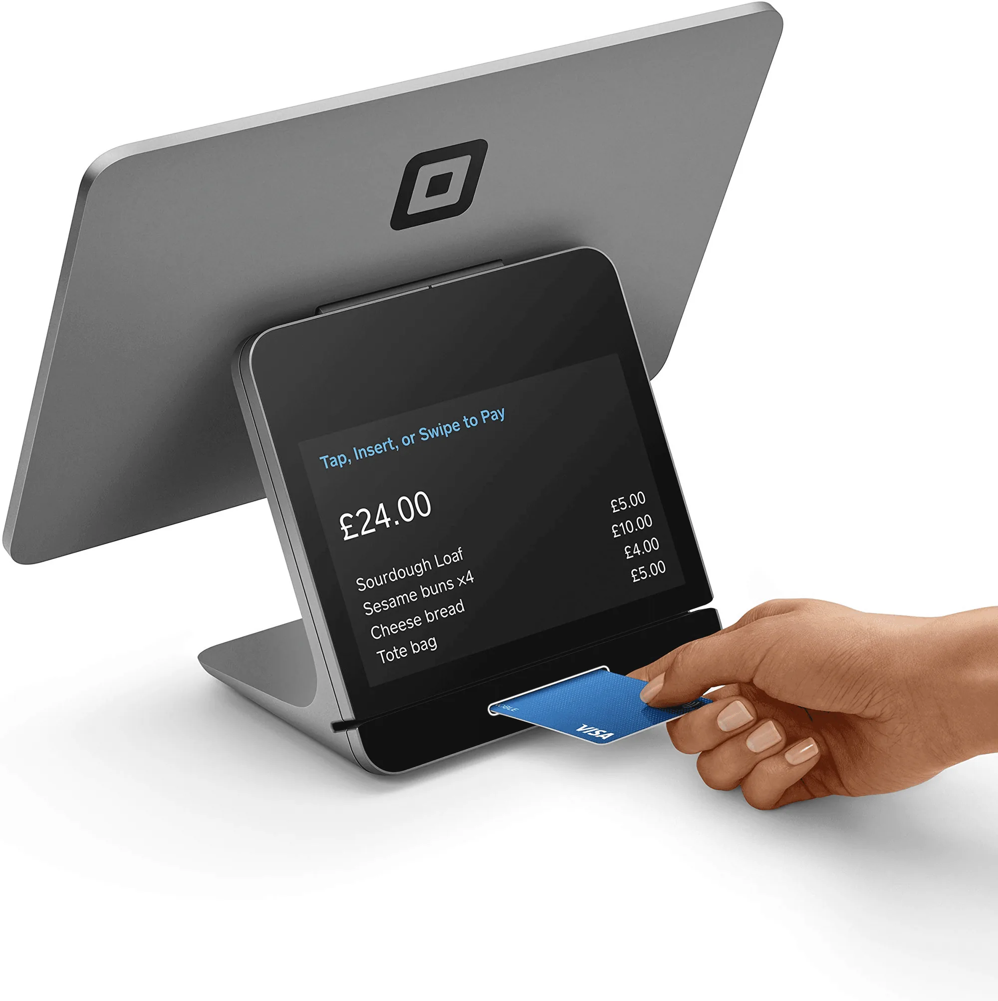 The product the exercise starts from. This image is Square's own marketing material, and not my work.
Two things need to be clear before any screen. The first is that this is a study: the brief comes from a bootcamp and uses a real company as its setting. Nothing here was made for Square, commissioned by them or seen by them. The second is that I worked alone, from the first desk research to the last component.
The method was planned in four stages from the start, and four months was enough to complete all four.
The process as it gets told afterwards: four stages, in a straight line.
Discover
- Desk research
- Competitor analysis
- Field research
- Canvas
- Survey
- Interviews
- Usability testing
Define
- How might we
- User flow
- Task flow
Develop
- Crazy 8's
- Scribble frames
- Wireframes
Deliver
- High-fidelity prototype
- Usability testing
- Refinements
What was not linear was the route. Notice that usability testing appears twice in the plan, in discovery and in delivery, and it was the second one that sent the project back to definition: age verification changed places when the product already had finished screens.
The research
I started with the market and finished with people. The order mattered less than I expected, because what changed the project came from the end.
Desk research. I gathered numbers on abandoned purchases due to queues and on preference for scanning your own products. They served the purpose that kind of data serves, which is confirming the problem exists and has a size. I record it with an honest caveat: these are 2023 numbers, from retail trade press, and self-checkout adoption in Brazil has risen considerably since. They justify the project at the time, and should not be read as a picture of today.
Competitor analysis. This was the part that taught me most about the category. Instead of comparing brochures, I went after records of real use from four competitors: Amazon, Zaitt, Shopic and Caper by Instacart. Each one became a band on the board, with a photo of the hardware, a photo of the screen in use, and a note on what that moment solved or got in the way of.
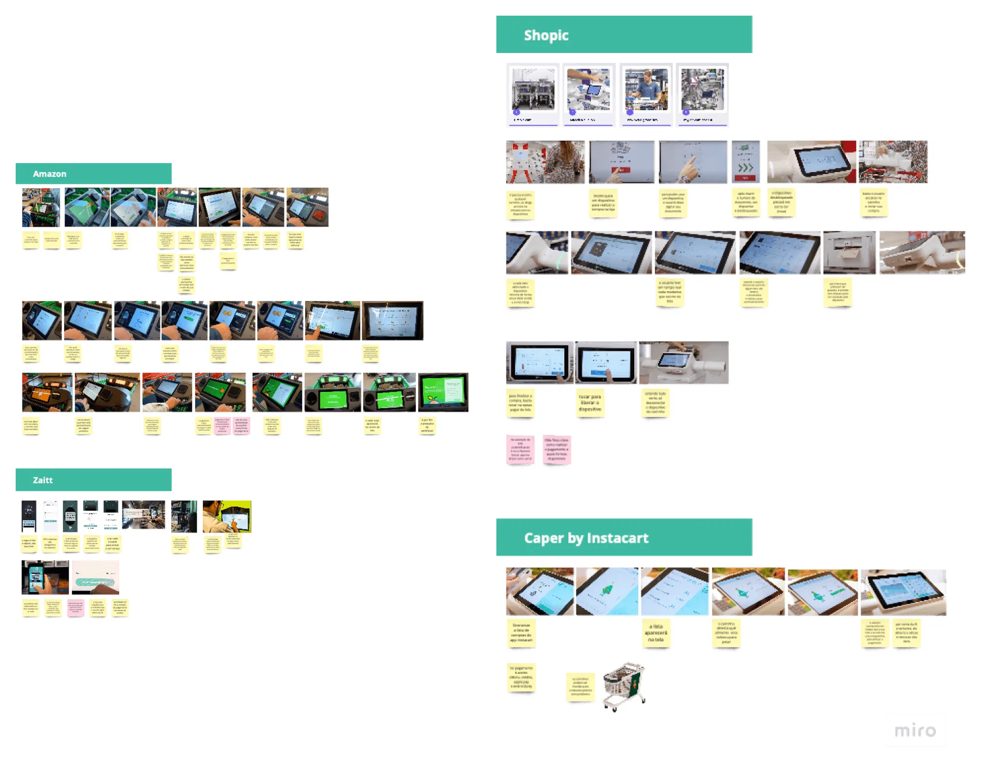 Four competitors documented by use, not by brochure. This is where the sense of what was already convention in the category comes from.
Interviews. Three people, around twenty minutes each, in person. The goal was to understand their preference regarding the kind of service they want at a supermarket, and the recruitment was deliberately broad: people who shop at supermarkets, whether or not they use self-checkout.
I went in with three competing bets on format, and they are on record in the guide: build only an app, build a kiosk to close the purchase, or build a tablet system with everything inside. The interviews existed to decide between them.
Three people is not a sample you generalise from, and nothing here should be read as statistics. It is a sample for finding direction.
What the data said
The strongest pain was not the queue. It was being stuck with no way out. This was the finding that turned the project around, because it contradicted the brief I had been handed:
"Most of the time people prefer a staff member's help so they don't waste time sorting out a system problem."
"Having people nearby helps me feel confident, and lets me get help fast if I need it."
Target 01 asked for total autonomy. What people described was something else: solving on their own the part that works, without being trapped when something fails. Autonomy, for someone shopping, is not the absence of staff. It is not depending on staff for the ordinary path.
People asked for the scale without knowing they were asking for a form factor. Two of the most concrete quotes were about weighing:
"I'd like to weigh the product at the self-checkout itself, to speed things up."
"A smart scale that understands what I want to weigh without me having to go somewhere else."
That settled the contest between the three bets. A phone app weighs nothing, and a kiosk at the end of the store forces you to walk there. Only the trolley-mounted tablet solved it, and that is why it won, not because it was the most modern of the three.
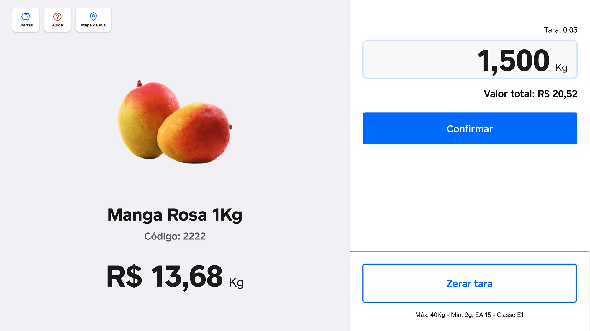 The built-in scale is the direct answer to two of the three interviews, and the reason the form factor is a tablet.
And one very concrete request came up: more payment methods, including meal vouchers. It was the easiest of all to satisfy, and the only one you can verify just by looking at the screen: debit, credit, cash, PIX, splitting across two cards, and VR in the row of accepted brands.
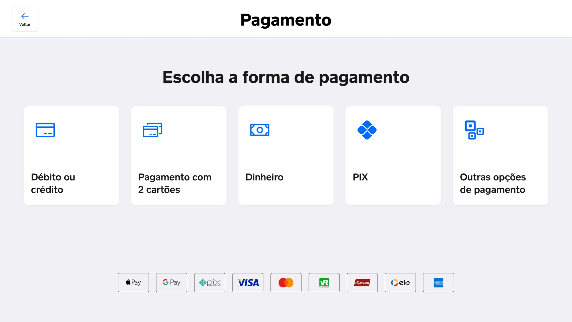 The request from one of the interviews, met and verifiable: VR is in the row.
The decisions
Help with a deadline, and with a way out
The help button does not open a chat or a call centre. It calls a real person and shows the countdown until they arrive.
The countdown is the whole decision. Without it, asking for help becomes an open-ended wait, which is exactly the state the interviews described as the reason people give up on self-checkout. With it, the person knows whether it is worth waiting.
And there is a cancel button, because someone who sorted it out in the first few seconds should not be held hostage by their own request.
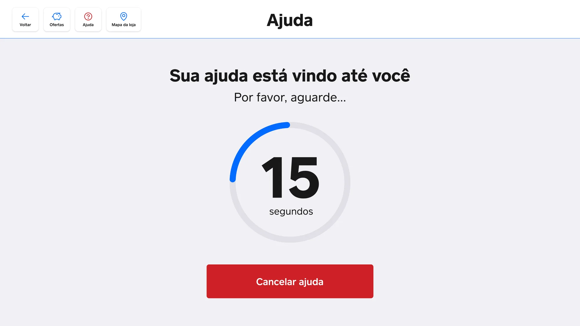 The countdown turns a call for help into a wait with a deadline. Cancel exists because not every request needs to be fulfilled.
The system is what finds the product
If the most common reason for calling someone is not finding an item, then finding an item cannot depend on calling someone.
Search returns the product with the aisle it sits in, marks the spot on the store plan, and shows the trolley's position relative to it. Anyone who would rather pick it up on the way back taps "Notify me", and the system tells them when they pass nearby.
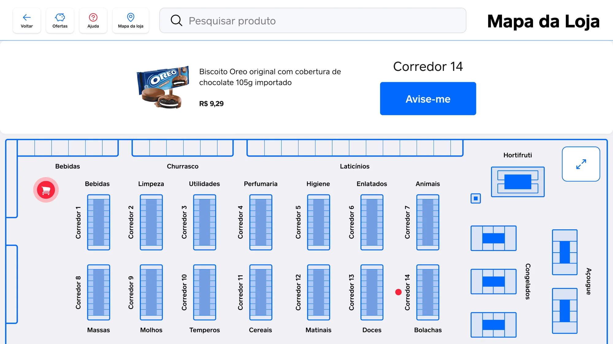 The plan answers "where is the item" and "where am I" on the same screen.
Interrupting only once
Some products require proof of age. The first version asked for that verification the moment the item entered the trolley, which is where the rule originates.
In practice that stopped the shop every time a restricted item came up. Verification moved to payment, once, with a national ID number. In the trolley there is only a note that the item will need verifying later.
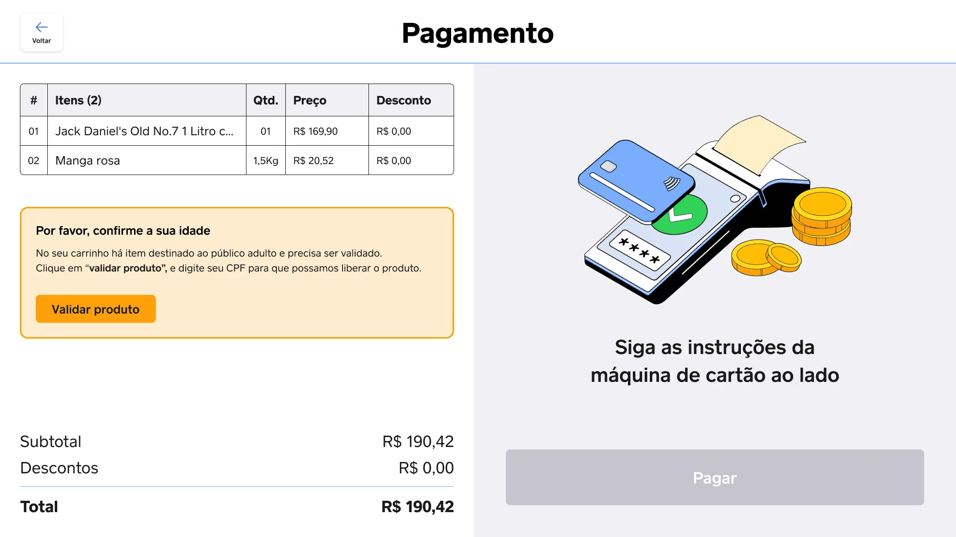 The rule still applies. What changed is how many times it interrupts the shop.
From problem to screen
Before drawing screens, I drew the service.
The canvas organised problem, users, competitors, alternatives and value proposition onto a single page. The caveat that was already in the original project holds: this exercise was done without a stakeholder, with data gathered from online research. It is a study canvas, not an alignment with whoever decides the business.
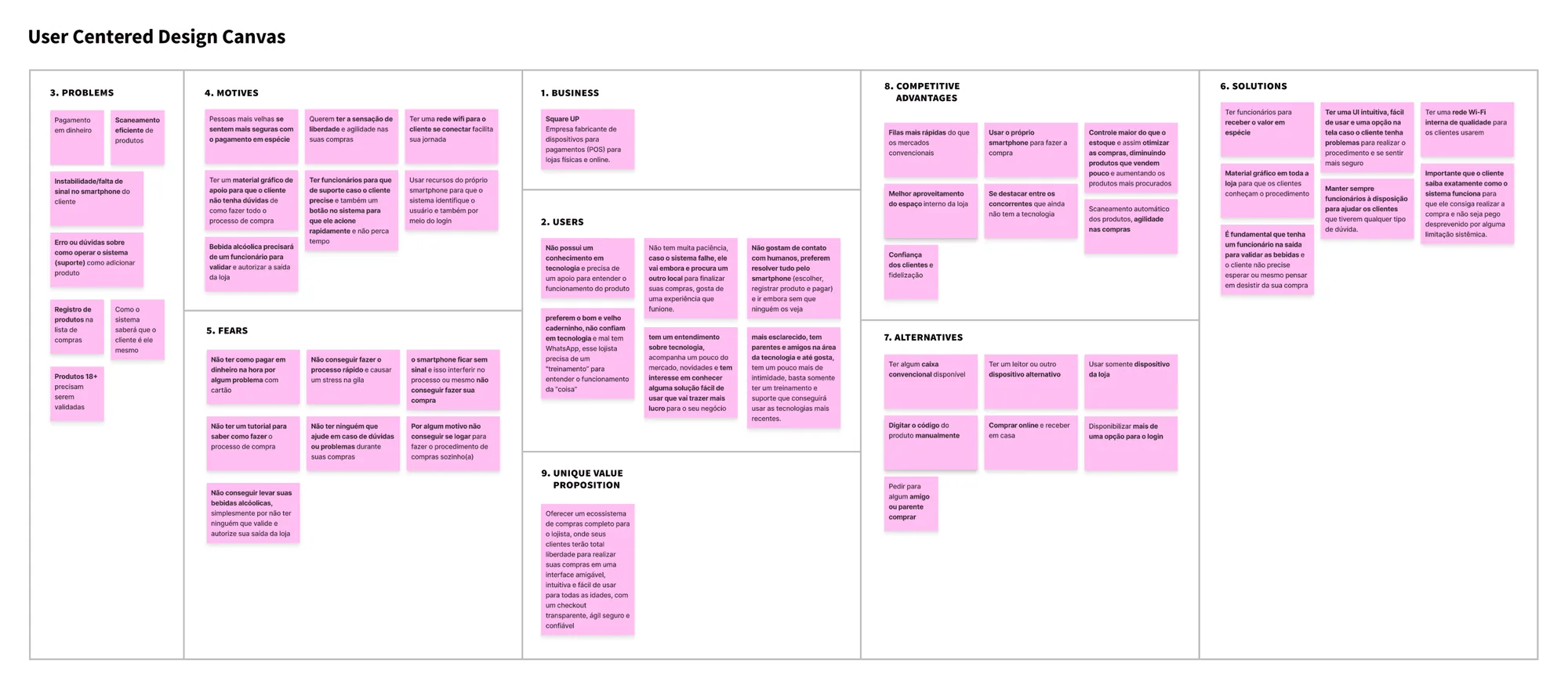 Done without a stakeholder, and that has been noted in the material itself since 2023.
The service blueprint was what changed the design most. It crosses the journey stages, from need to post-purchase, with what the person does, the touch points, what the system does underneath, the pains, the opportunities and the possible solutions. That is where age verification appears as a service problem, not a screen problem.
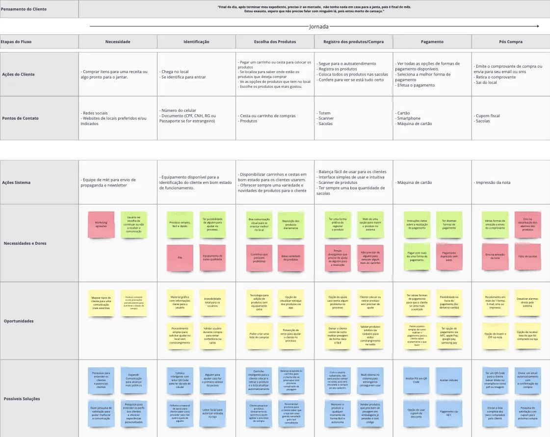 Stage by stage, what the person does and what the system has to do for it to work.
The task flow mapped the paths with the decisions made explicit, including the ones that do not lead onward.
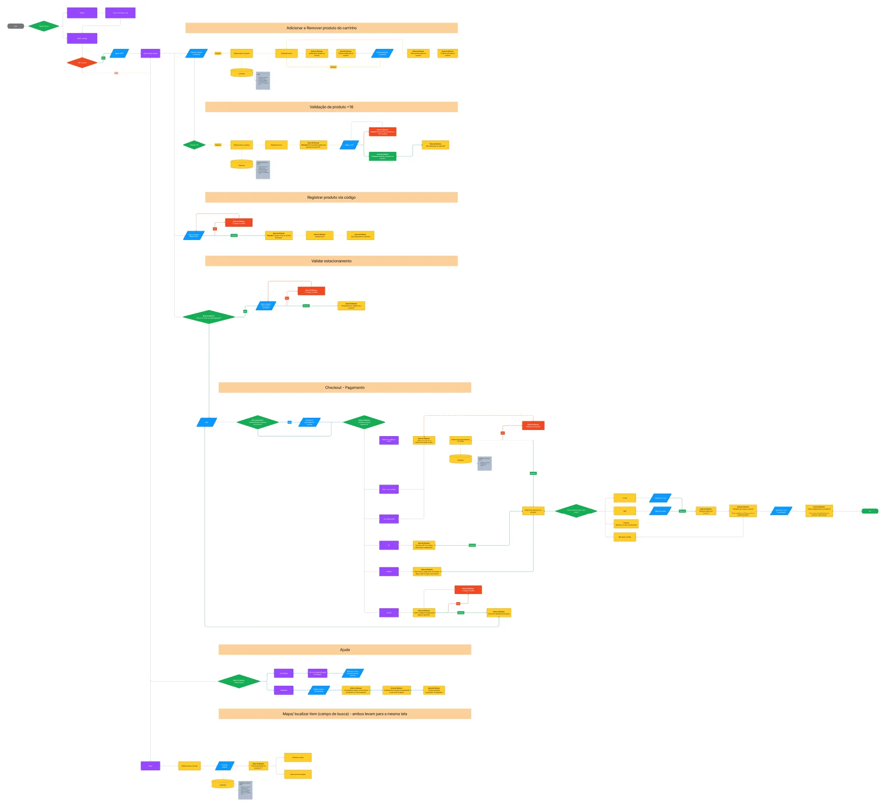 Every diamond has an exit on both sides. The ones that go wrong needed screens too.
Only then came the sketches. I did Crazy 8's and scribble frames on paper, to try screen arrangements without getting attached to any of them.
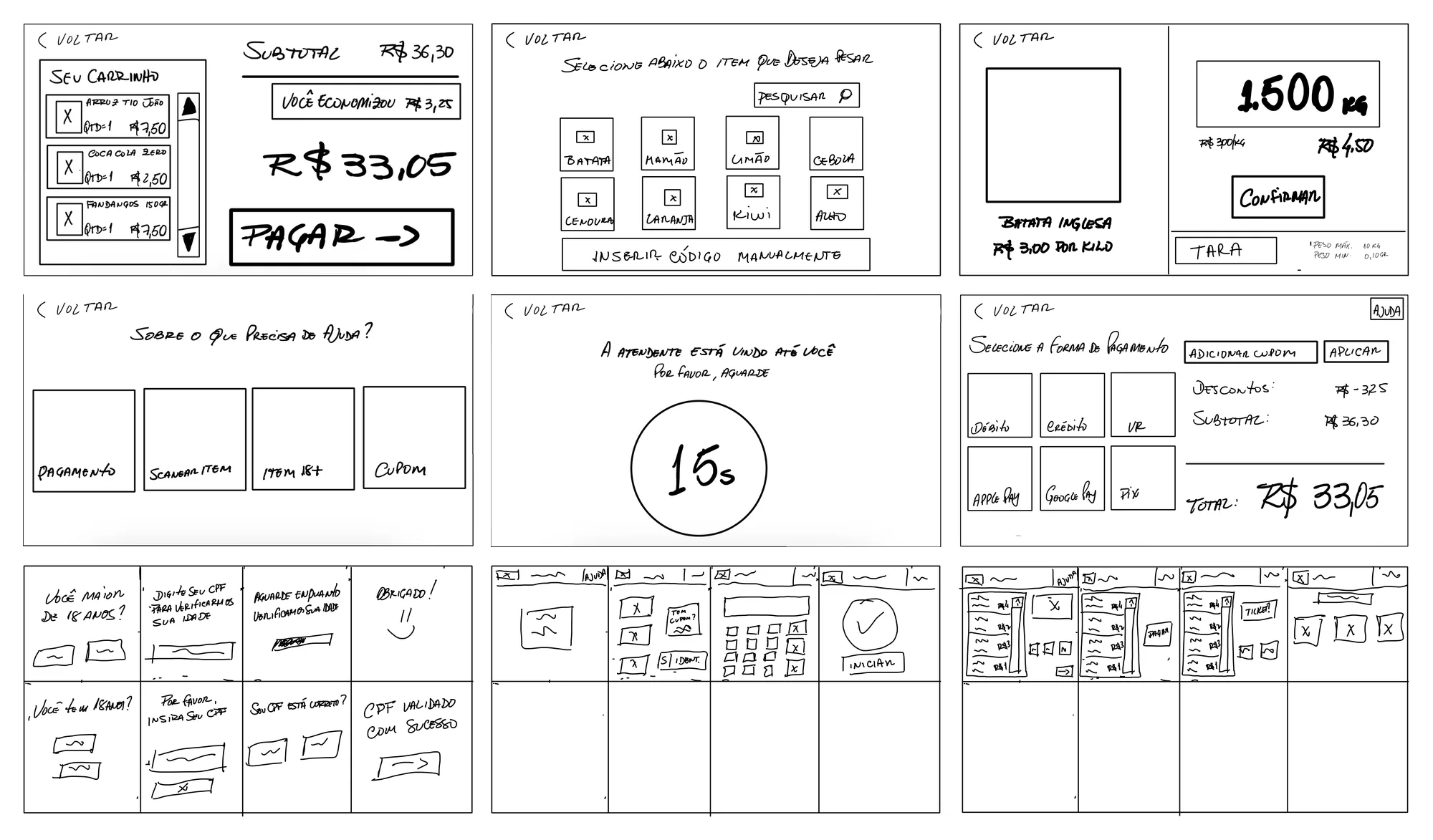 Pen and paper first. A bad idea discarded here costs minutes, not days.
In the mid-fidelity wireframes I made a decision that slowed the start and paid off at the end: not using any ready-made UI kit. I wanted to discover the components by drawing the screens, rather than fitting the screens into components someone else had already solved. This was the version that became a clickable prototype and went into testing.
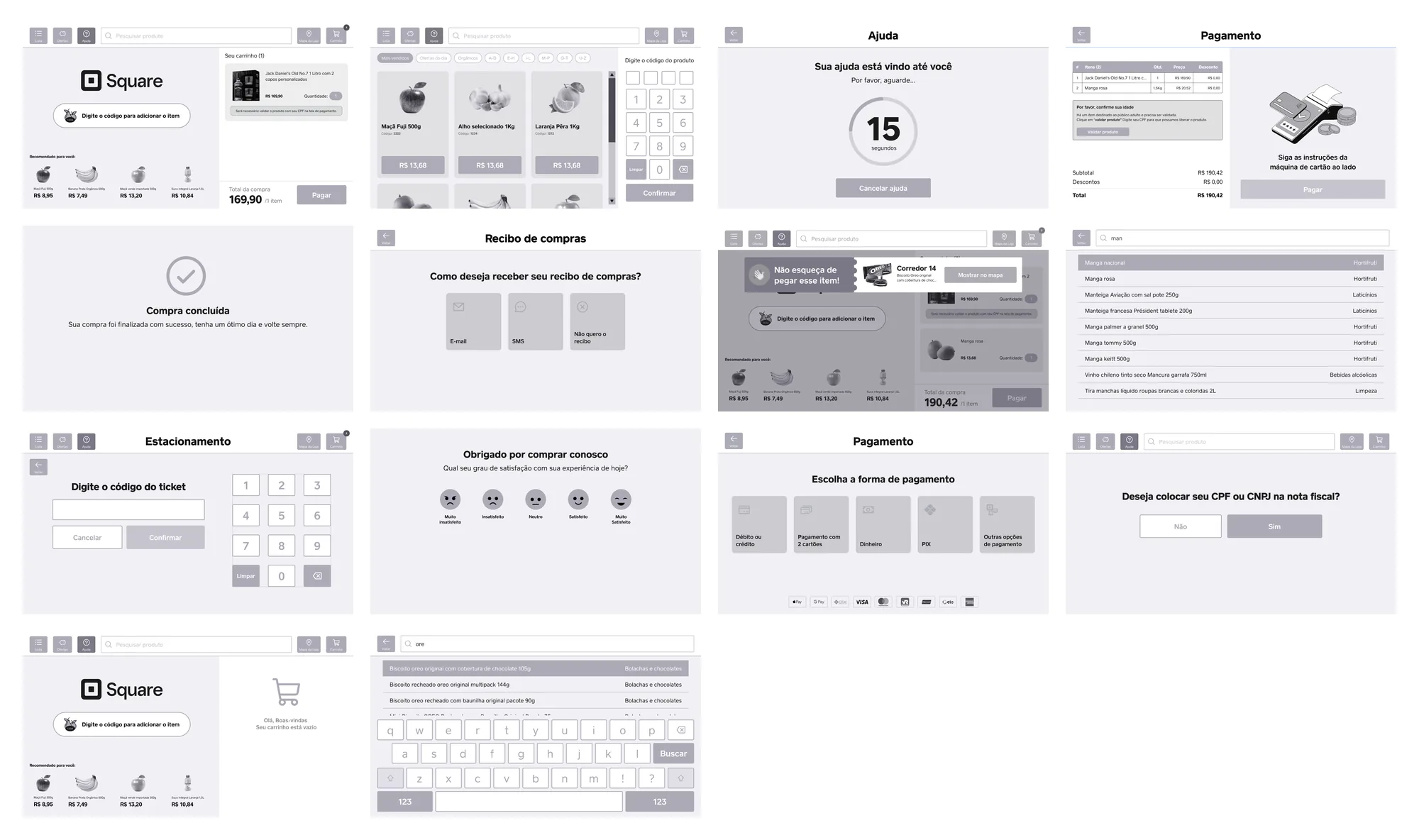 The version that went into participants' hands. Mid-fidelity on purpose: too much polish turns the test into an aesthetics review.
The system underneath
The moodboard was less about aesthetics and more about who uses this. A supermarket is one of the few places everyone passes through, and the reference had to show that: different people, products, where what you buy comes from, and what happens once the shopping gets home.
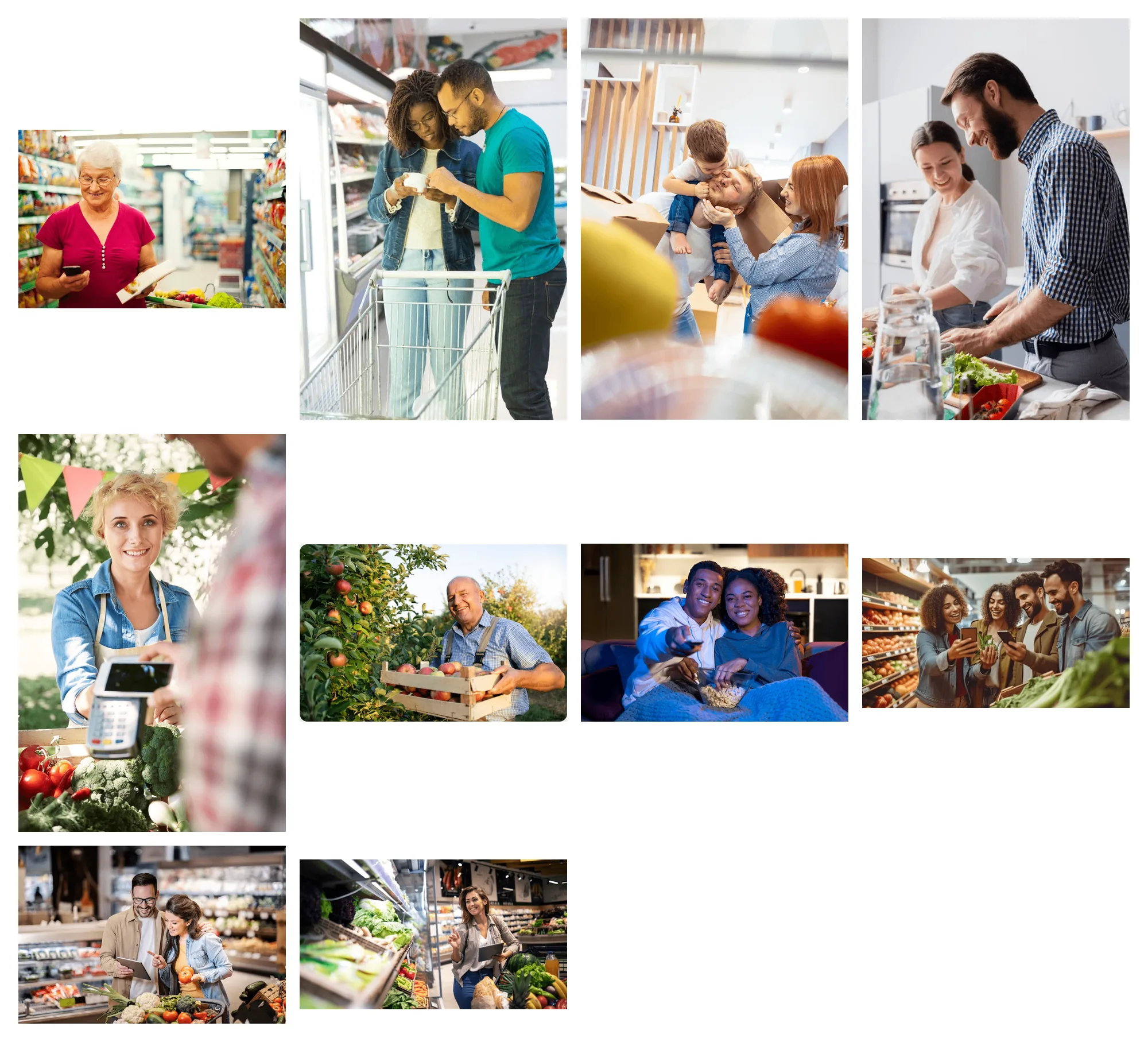 The reference is the audience, not the interface. Everyone uses supermarket self-checkout.
On the interface, the decision was not to invent. Square already had an established design system, and the exercise was to extend an existing product, not replace it. I designed new components for what self-checkout required, following what was already in use.
The trolley item is the example. It is not a list row: it is a component with state. Going in, coming out, and the variant that carries the pending verification notice.
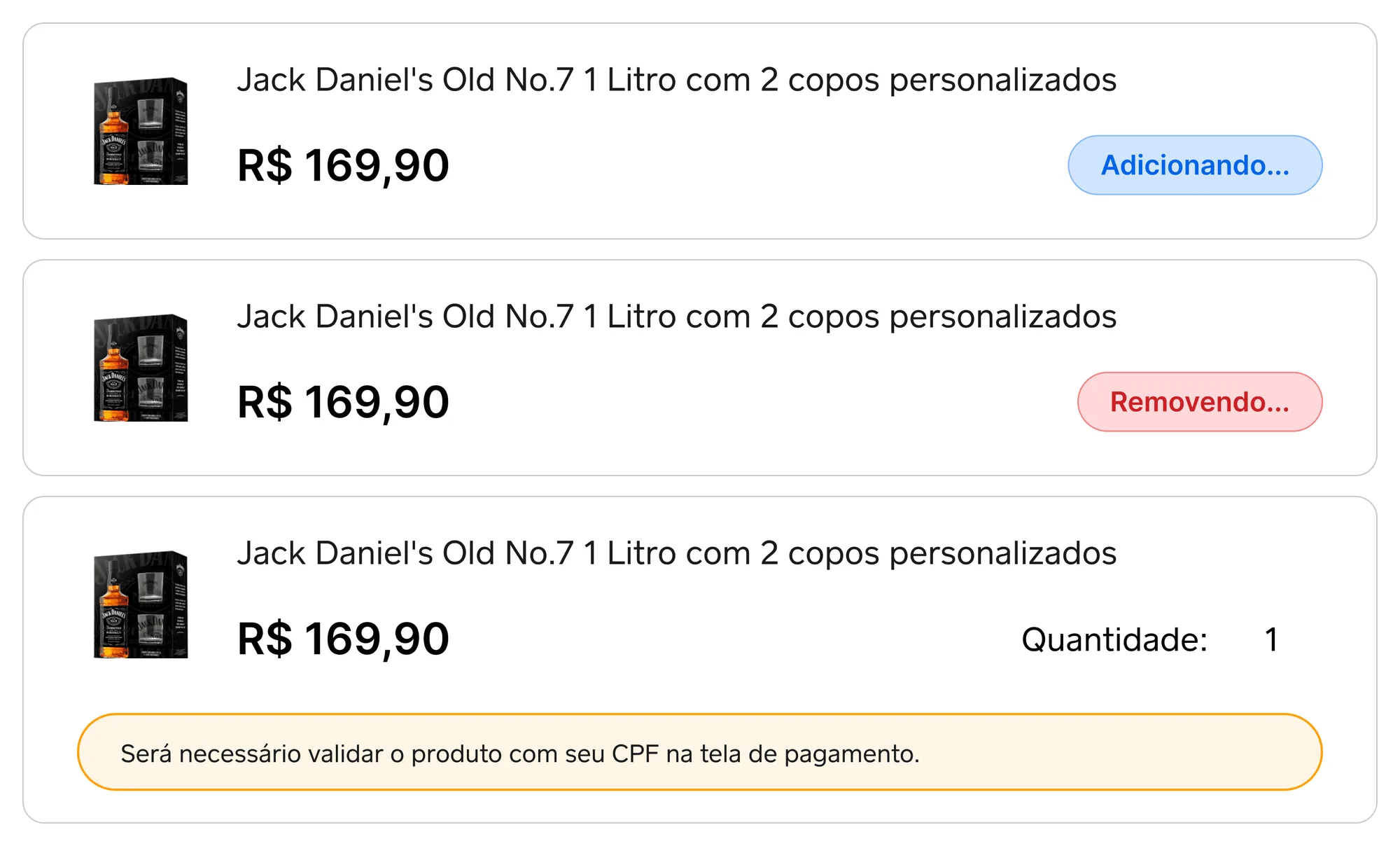 The same item at three moments. The verification notice is component state, not a separate screen.
And the diagram below is the product on a single page: the screens and the links between them.
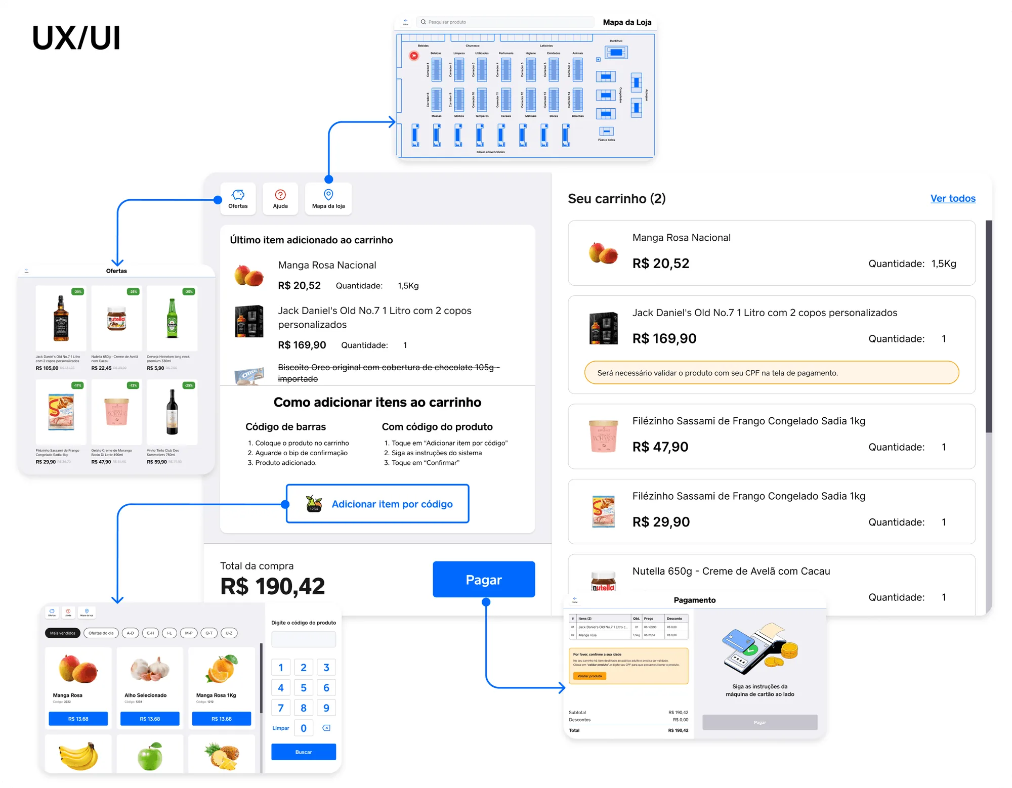 The screens and the paths between them. The store map is reachable from any point, and that is a decision, not left-over layout.
The product running
The case so far shows decisions. These recordings show the result of them in motion, in the high-fidelity prototype.
Notice two things that did not come from the research and went in because the product needed them to exist: parking ticket validation and choosing how to receive the receipt. And notice the ticket error state, with the rejected code in red. In a system with no staff member on the other side of the counter, the screen that goes wrong is as much a part of the product as the one that goes right.
5 gravações, 1 min no total
Scan products by barcode, or type the item code.
Weigh fruit and veg at the station itself, without walking anywhere.
Validate the parking ticket before paying, including when the code is wrong.
Pick a payment method and prove your age once, at the end.
Get the receipt by email and rate the experience.
The test, and what it changed
Usability testing was done in person, with the mid-fidelity prototype on a tablet, to get close to the real situation of doing a shop and paying on the device itself.
Two changes came out of it.
Age verification changed places. It used to happen when the product entered the trolley, and moved to happening once, at payment. That is what participants preferred, and it is the decision described above.
Search became the centre of the screen. The search bar grew, results started appearing in real time with the section the product is in, the route to it became visible from wherever the person stands, and "Notify me" gained the proximity alert. What existed before was too much information, some of it duplicated.
Here I need to be clear about a gap in this case: I have no visual record of the test. It was done in person, with people using the tablet, and I did not keep the comparison between the tested screen and the adjusted one. The changes above are described because they happened and shaped the final version, but the case cannot show them side by side, and I am not going to assemble a comparison afterwards that did not exist at the time.
What I would do differently
The lesson I took from the project at the time was about business: understanding the problem alongside whoever decides, rather than solving the interface and presenting afterwards. It still holds, and the canvas done without a stakeholder is the evidence of it inside the material itself.
Revisiting now, I add a second one, and it is more uncomfortable. I was handed a brief that said total autonomy and spent months building on it, even after the interviews said something different. The decisions turned out right, because the help screen and the store map exist precisely because of what people said. But I never went back to the brief to fix the statement, and kept calling autonomy something the research had already redefined.
That is the lesson I take: when research contradicts the brief, updating the screens is not enough. It is the brief that needs rewriting, or the next decision comes out of the old premise all over again.