This case started as a weekend project and became something else a year later. It is worth telling in that order, because the second pass changed what I understood about the first.
The starting point
The hackathon theme was Vertical Smart Cities. Eight teams started and half made it to the end. I worked with two other people, and handled the research, the flows, the interface and the pitch to the jury.
It was my first hackathon. I had wanted to do one for a long time and the chance had never come up.
We picked parking because it is an urban problem everyone in the room had lived through. That is a good reason to pick a subject and a terrible reason to assume you already understand it. The research made that clear.
The concept had two sides from the start. On one, the driver looking for a spot. On the other, the garage owner, who needs to fill the spaces they have, and for whom the project's second stated goal was maximising occupancy and revenue. Within a weekend, only the driver's side got designed, and that is the side this case is about.
The path was not linear either, and the project records that in a way I did not want to lose in bringing it here.
The process as it gets told afterwards: four stages, in a straight line.
Discovery
- Desk research
- Competitor analysis
- Survey
- User interviews
- How might we
Define
- Problem statement
- Proto personas
- Service blueprint
Ideate
- Information architecture
- Userflow
- Wireframes
- Moodboard
Develop
- Visual direction
- Interaction
- High fidelity
The button above exists because the tidy version is always the one told afterwards. Not everything mapped out there was finished within the deadline, and that is what the end of this case is about.
The research
I ran two tracks, with different purposes.
In-depth interviews, with a ten-question guide organised into five themes: behaviour and habits, pains and frustrations, perceptions and needs, experience with technology, and suggestions. Run in person and over video calls.
Before each conversation I read an opening script asking permission to record the audio, and explained why: recording meant I did not have to write while the person talked, and did not interrupt their train of thought. It sounds like bureaucracy. It is not. It is what lets you actually listen, instead of transcribing.
A structured survey, with eleven participants and eight questions, tabulated into a participant-by-question matrix. The interviews were there to understand how people decide; the survey, to know how many think alike.
Eleven people over a weekend is not a sample you generalise from, and nothing here should be read as statistics. It is a sample for finding direction, which was what the deadline allowed and what the decision required.
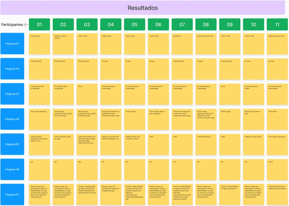 Every count in this case comes from here. Nothing was rounded to sound better.
What the data said
Parking is a daily routine, and so is the difficulty. Seven of the eleven participants park every day. And not one answered that they never struggle to find a spot: two said "always", five "often" and four "sometimes". This was not an occasional weekend annoyance.
The strongest pain was not the spot. It was feeling unsafe. This was the finding that changed the project most, because it was not what I expected to find. Eight of the eleven answers to the open question about frustration talk about fear, theft or lack of safety, and in very concrete terms:
"No spaces, or a guy on the street charging you to watch your car."
"Paying for street parking and leaving the car unprotected."
"The risk of coming back and not finding the car."
I had gone in thinking the problem was lost time. Time does show up in the data, but it loses to the fear of leaving the car somewhere and not finding it later.
Behaviour changes with how well you know the place. Two people described the same strategy without comparing notes:
"If it's somewhere I know, I already know where there's a bigger area to park and I know the way. When it isn't, then I look it up."
People were already describing the product on their own. Asked what they would want to see in an app, one participant answered with a finished model:
"Price, location, book ahead. Like Uber: place and time."
But the most requested feature in the survey was not booking. It was seeing availability in real time: nine of eleven picked that option, against six who picked booking ahead. Before securing a spot, people wanted to know whether there was one.
The two strongest findings ended up on the same screen. The home opens with a map showing how many spots each garage has free right then, which was the most requested feature, and the line above the search field says "let's find you a safe spot", because safety was the word that came up most in the answers.
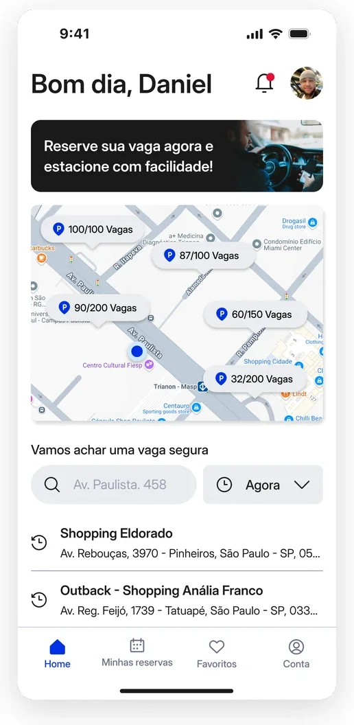 Real-time availability and the word safety, the two research findings, on the first screen of the app.
And nobody knew the category existed. "Never used one." "Never used one, don't know any." "I've never seen an app that does that." This was not about improving something people already had a model for. It was introducing an idea.
There was a price ceiling, and it was low. No participant would pay more than ten reais per booking, and four expected it to be free. Any business model would have to fit inside that.
And a pain came up that the product does not solve. Two people volunteered, unprompted, that their difficulty was manoeuvring:
"Parallel parking is hard for me."
It was not in the survey, so I do not know how widespread it is. It goes on record as a lead, not as a finding: StopCar helps you find and book, but parking the car is still on you.
The decisions
Separating people who need it now from people who are planning
The quote about familiar and unfamiliar places describes two situations that look the same and are not. Someone already driving around wants this over in seconds. Someone leaving home in three hours wants to choose carefully.
A single flow would force both down the same path, and the path that is good for one is bad for the other: too many filters gets in the way of someone in a hurry, and too much hurry gets in the way of someone comparing.
So the entry splits right at the start, into book for now and plan your booking. The screens after that converge, because choosing duration, vehicle and extras is the same either way. What changes is the door.
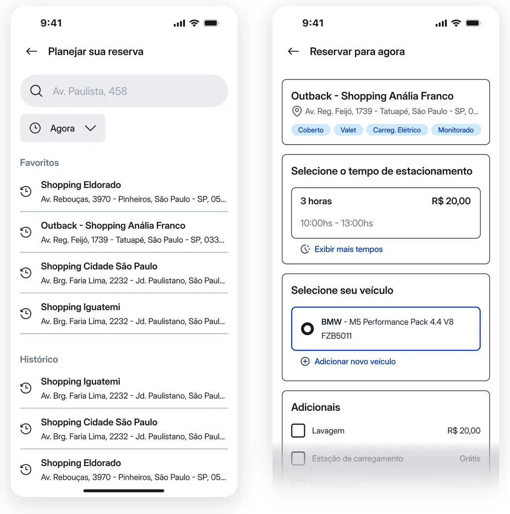 People planning start by looking for a place. People in a hurry start with the place already settled.
Showing enough to decide without driving there
Since nobody knew the category, the barrier was not using the app. It was trusting it. Booking blind somewhere you are going to leave your car is exactly the fear the research surfaced.
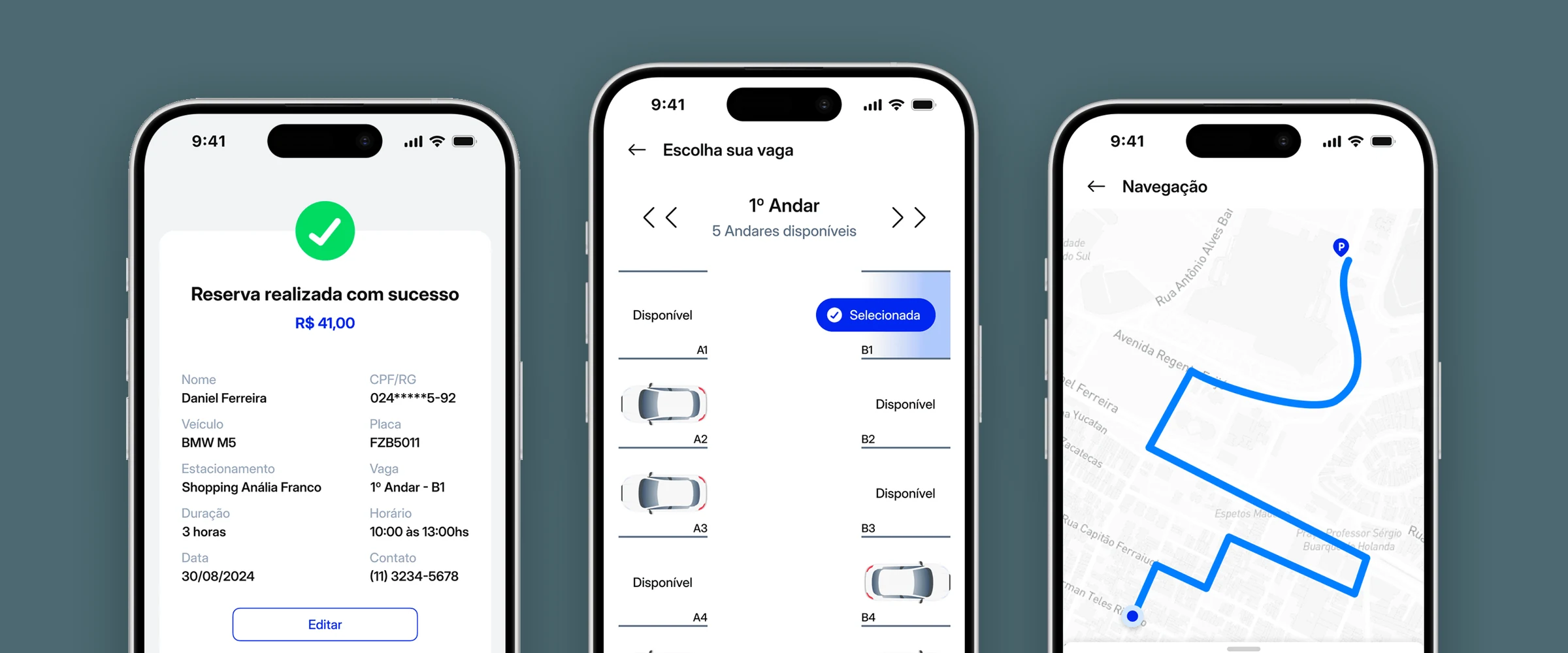
The detail screen brings together location, availability, price, opening hours and garage information before any confirmation. And the choice goes down to the floor and the specific spot, which answers the hackathon theme through something concrete: vertical parking, with the spot identified by height, rather than a generic address.
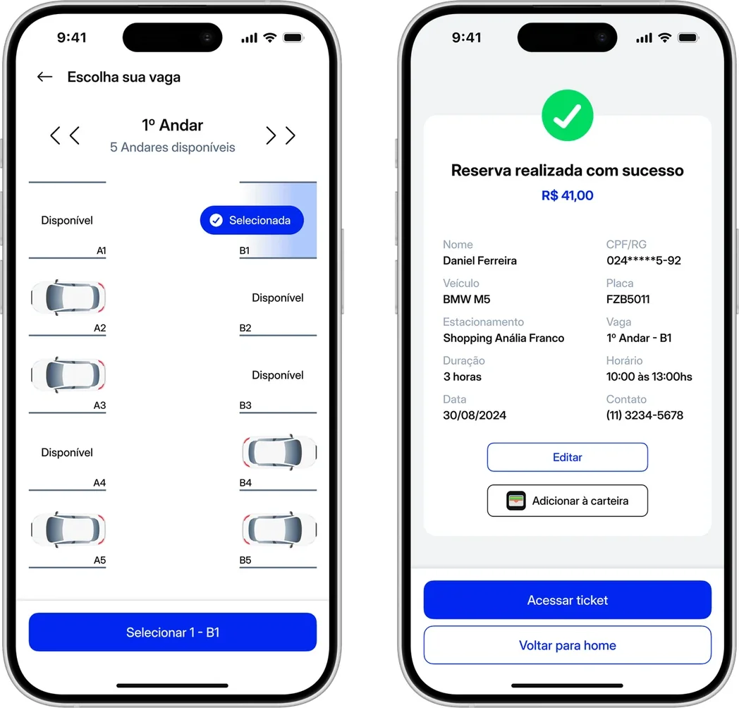 The spot has a floor and a number. The same detail reappears in the confirmation, because that is what the person will be looking for on arrival.
Not ending at payment
A confirmed booking is not the end of the task. The person still has to get there, get in, and sometimes stay longer than planned.
The flow continues past payment: navigation to the garage with time and distance, starting the booking, extending it, and history. If the product existed to reduce insecurity, abandoning the person while they are still far from the car would contradict its own premise.
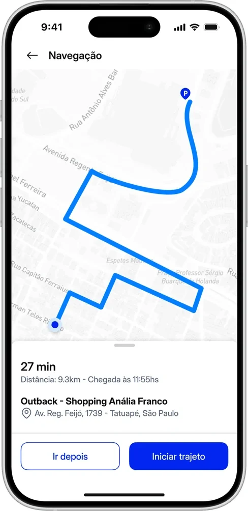 The go-later button exists because not every booking is for now. The screen had to serve both beginnings.
From flow to screen
Before drawing screens, I drew paths.
The flowchart covers entering the product and the points where the person decides: whether to enable location, whether to sign in by phone, Apple, Facebook or Google, and what changes when the user is new. Every branch out of a diamond has a destination, including the ones that do not lead onward.
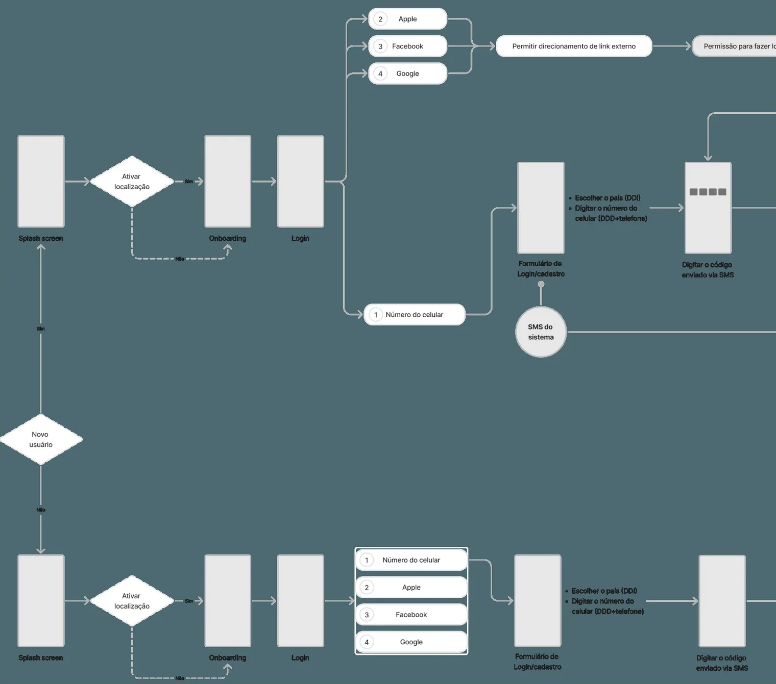 Entry flow with the decisions made explicit. Every branch has a destination, including the ones that stop.
The service blueprint went further than the screen. For each stage it separates what the person does, what they see happen, what the system does underneath, and which tool that depends on. That is where it is recorded that "spot available" is not interface information: it is a database query that also has to hold the spot temporarily while the booking is unconfirmed.
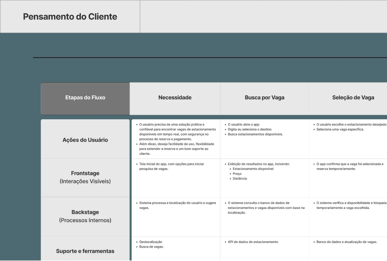 What the person sees, what the system does and which tool it depends on, stage by stage.
And the screen map shows the real size of what was designed, well beyond the screens this case can show one by one.
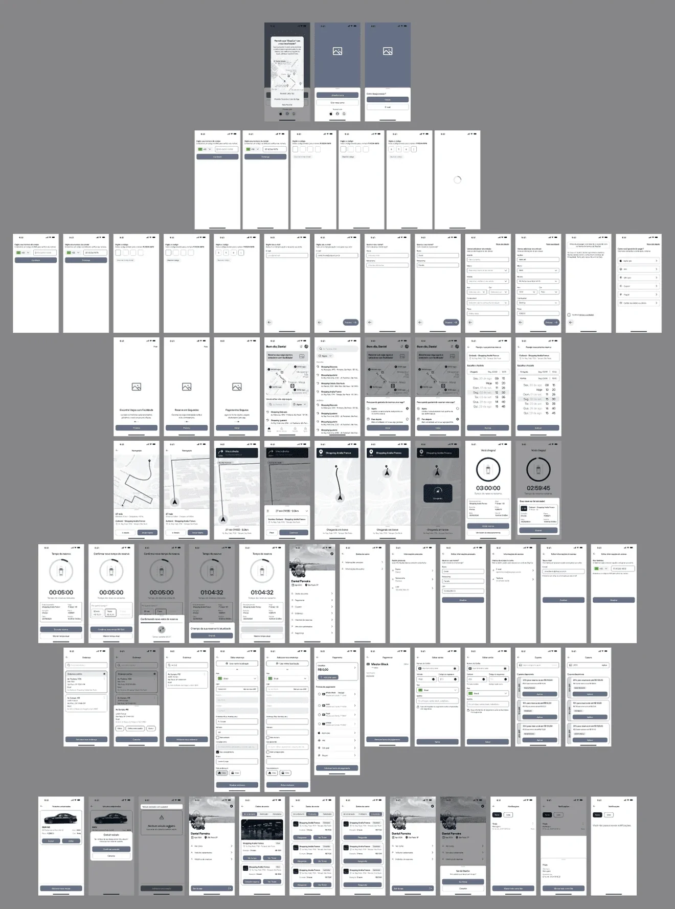 The whole product, screen by screen. The ones in this case are a selection.
The system underneath
The map came before the screens. Every area of the product with what belongs inside it, from the obvious ones like search and book, to the ones that only show up later, like saved vehicles, favourites and history.
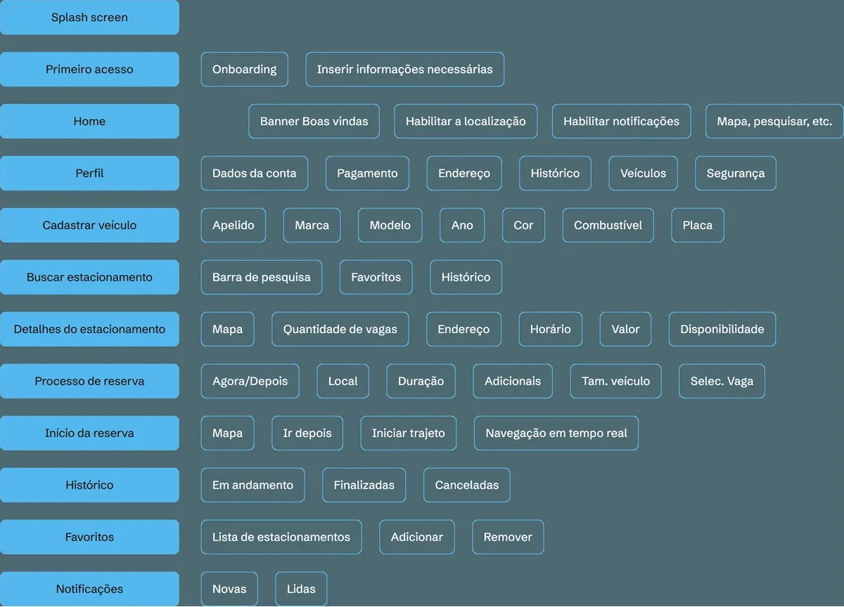 The whole product on one page. This is where it becomes clear that booking was only part of it.
The brand came from the same place. The symbol is a location pin standing in for the "a" in StopCar, which solves the name and the icon with a single drawing, and stays legible reversed on a dark background.
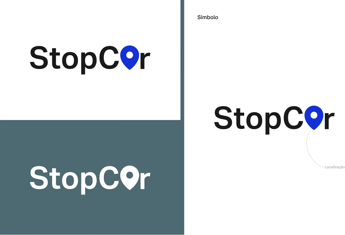 One drawing that works as a logo and as the app icon, without needing two solutions.
Beyond the flows, I built the visual foundation: a palette with contrast ratios annotated, a type scale, and an icon library.
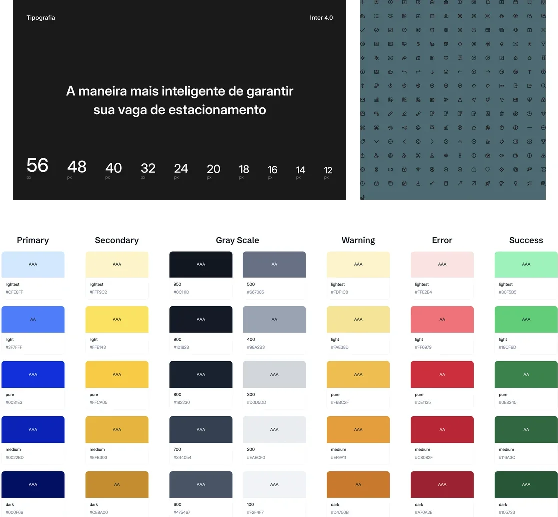 The AAA and AA marks on each tone are not decoration: that was the contrast check done before using the colour, not after.
And on top of that foundation, a component sheet reused across the screens.
In a hackathon that sounds like a luxury, and it is the opposite: with time so short, having components ready is what made it possible to redraw a flow without redrawing every screen.
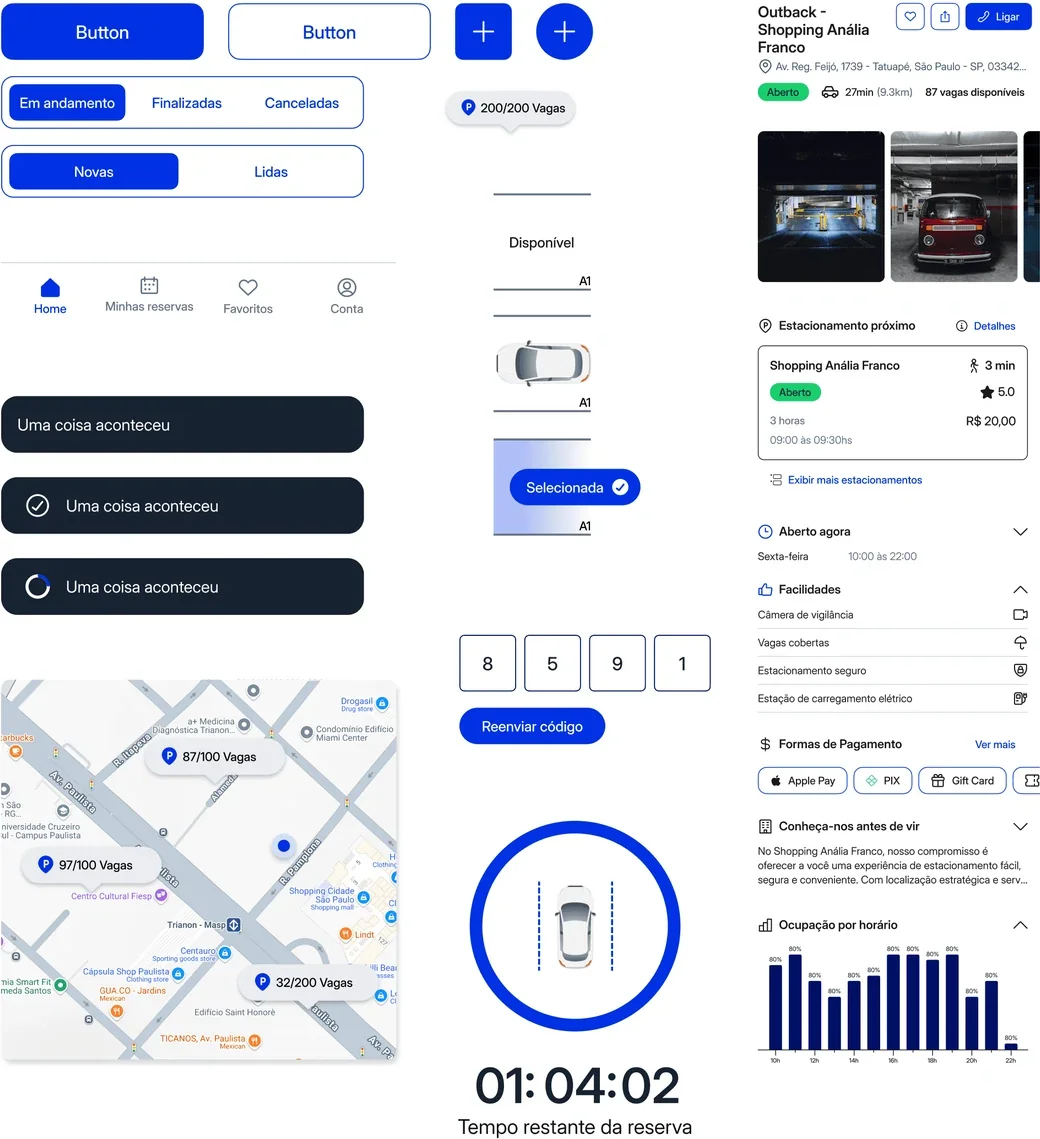 Every piece here appears on more than one screen. That is what let the flow be rebuilt without rebuilding the interface.
The product running
The case so far shows decisions. This section shows the result of them in motion: the recordings of the high-fidelity prototype.
Notice what appears here and did not come from the research. Saved vehicles and history came out of the architecture map, not out of a finding with a user. They are what the product needed to have in order to exist, not what it needed to solve. In a hackathon there is no time left to validate that part, and it went in anyway.
12 gravações, 6 min no total
Location permission
Arriving at the garage
Confirming the extension
Sign-up that is simple, quick and gets out of the way.
Check everything about the garage before booking a spot in it.
Book a spot for right now, and get in straight away.
Book a spot for later and lock in the day and time you want.
Payment that is quick and straightforward, so the spot is yours.
Start the trip and let on-screen navigation take you there.
Start your booking with one tap, and extend it if you need to.
Save your vehicles so booking takes fewer taps next time.
Get to your whole booking history.
What happened
StopCar took first place. The jury pointed to how new the proposal was as the reason.
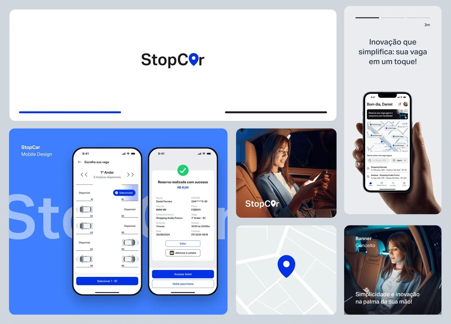 The board that brings brand, product and positioning into a single composition.
It is worth saying what that is not. A hackathon rewards a proposal, not a product in use: StopCar was never launched, never had a real user, and has no adoption numbers to show. What this case proves is the reasoning up to the decision, not its effect on the world.
What I would do differently
I came back to the project in 2024, and the most revealing thing was not a screen: it was discovering that I had collected the research and never synthesised it.
The 2023 board has the objective, the guide, the transcripts and the tabulated results matrix. It also has two columns, insights and "how might we", with the sticky notes blank, still carrying the tool's placeholder text. At weekend pace, the data turned into decisions directly, skipping the step that turns an answer into a conclusion.
The decisions turned out right. But they were right by well-informed instinct, not by reasoning I could show anyone. The synthesis holding this case up was done afterwards, rereading the original material, and only then did the finding about insecurity become visible to me. It had been in the data since 2023.
That is the lesson I take, and it is not about parking: research that is not synthesised becomes memory, and memory cannot be audited.